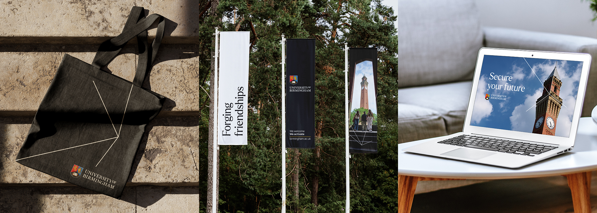
The philosophy also informed the ‘Language of Activation’ - a series of brand voice traits that informed an open-source strapline that could be used by all departments of the university e.g. ‘We advance. We activate.’ The flexibility of this caters to the complexity and scale of audiences and ensures greater internal stakeholder buy-in of the brand.
University of Birmingham
SCROLL

University of Birmingham’s visual identity and brand communications had not kept pace with the ambitious scale and momentum driving its growth. The brand needed to reflect the institution’s heritage while embracing a future-focused, contemporary approach to effectively connect with a wide and complex stakeholder community.
An extensive stakeholder engagement phase allowed us to capture the opinions of over 1000 people, providing invaluable insight to inform an authentic strategic brand framework. This included developing core brand themes and a brand philosophy – ‘Activate With Intent’. A core idea with the ability to reflect the purposeful, uncompromising attitude of the university and empower the brand with the ‘voice of activation and progress’. This is the philosophy that drives creative decision-making across the board – from tone of voice to imagery choices, ensuring every visual element of the brand captures the essence of what it means to ‘Activate With Intent’.
Loading

Crafting a new identity
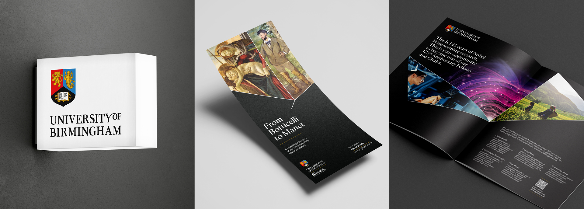
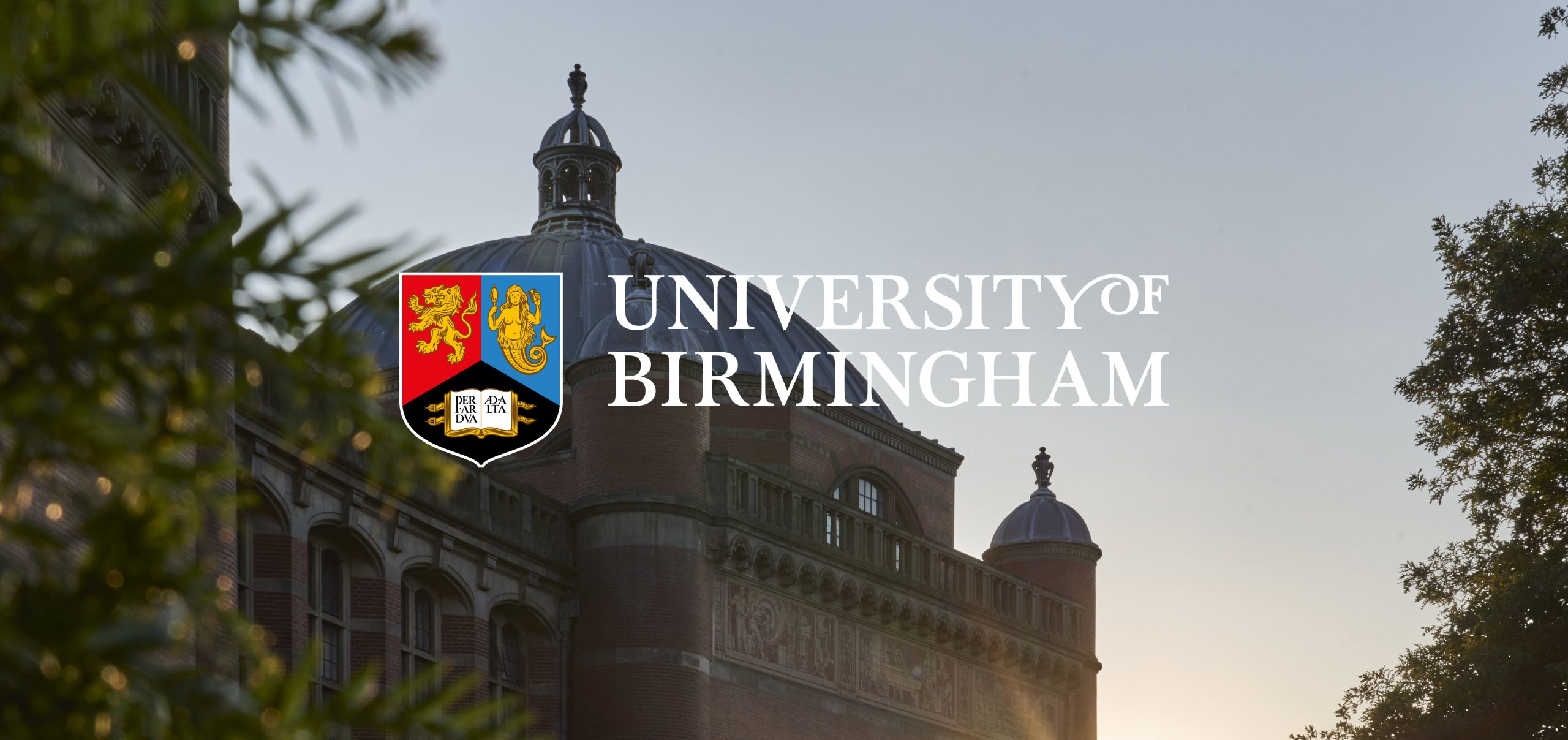
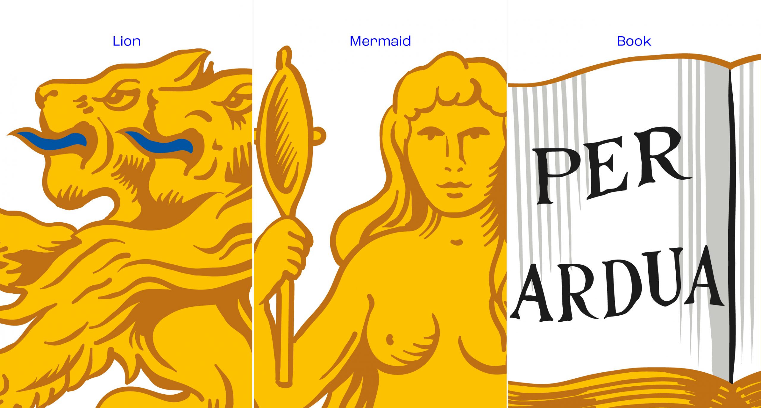
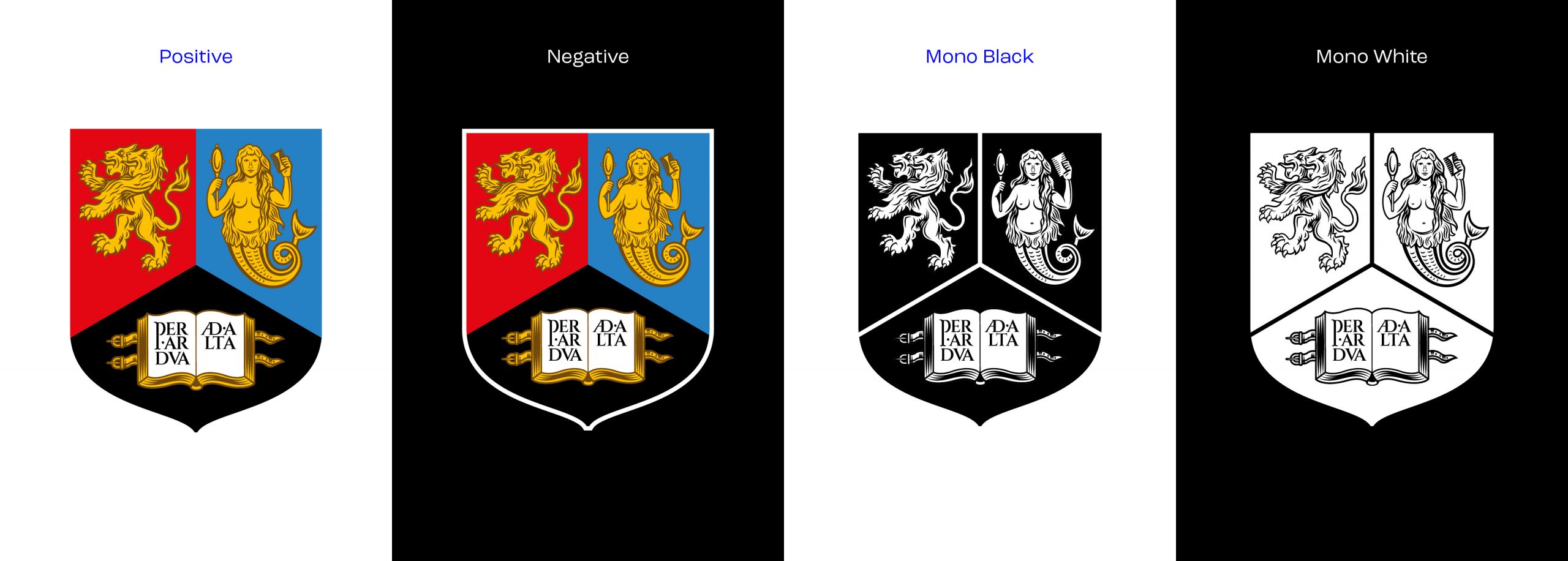
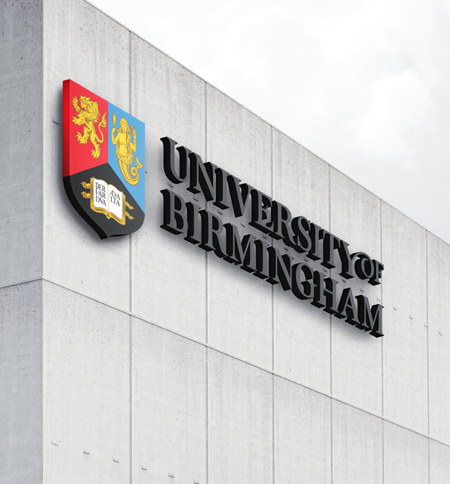
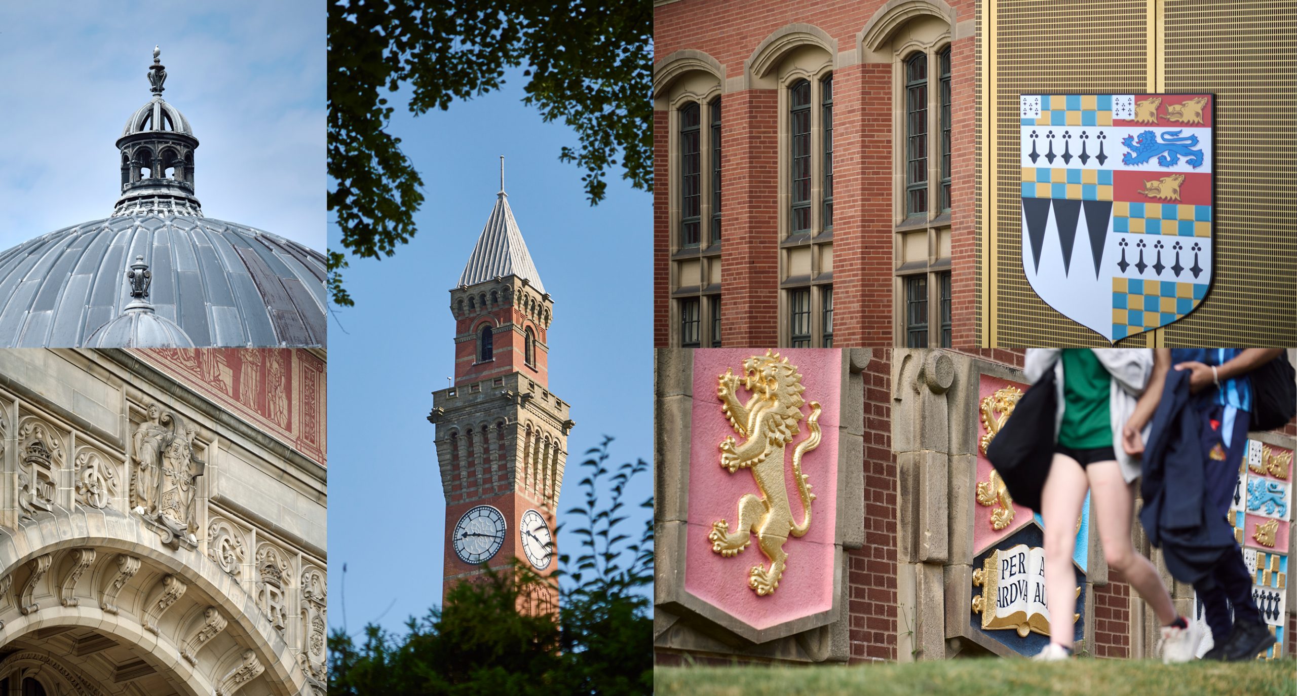
Our engagement process uncovered the depth of positive feeling towards the universities crest identity and after an in-depth visual interrogation of each element, we redrew the crest for optimisation in small and digital formats.
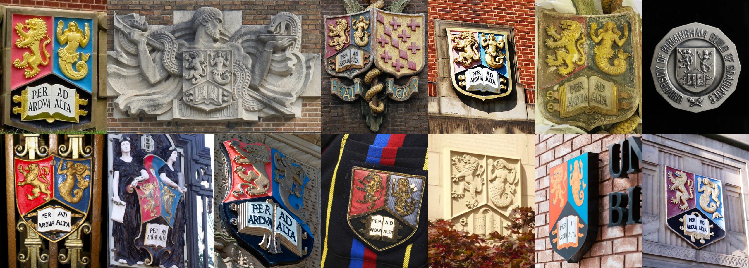
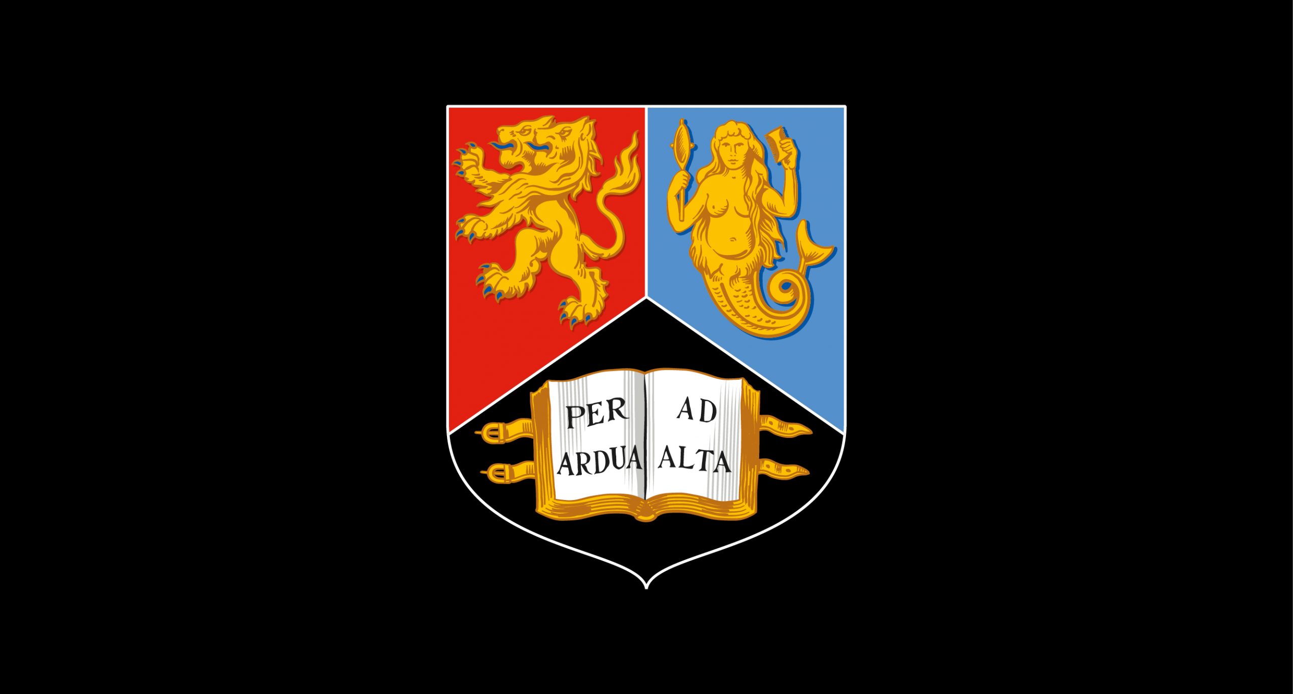
We re-created these for greater consistency, more accurate reproduction and enhanced visual uniformity and precision.
Loading
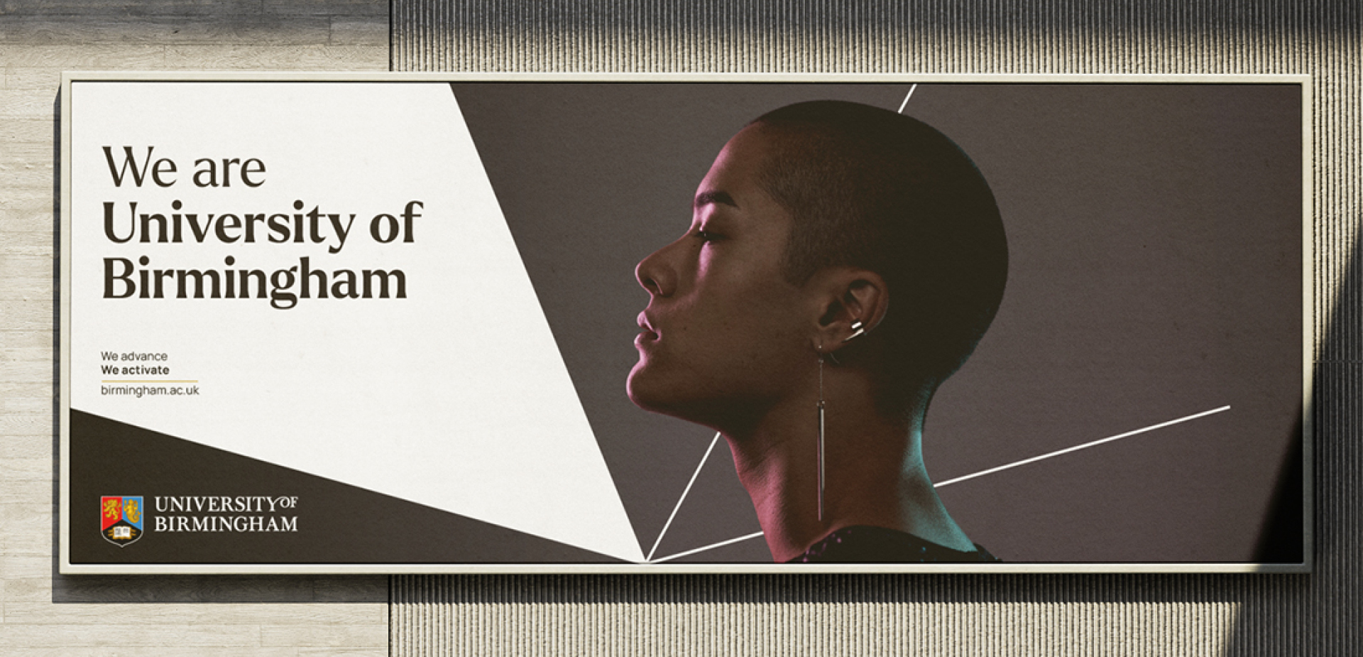
Creating an ‘active’ brand system
The system, colour palettes and typeface choices have gone through extensive online and in-person accessibility testing across print and digital outputs. This gives us an ability to enable creative freedom and greater flexibility for brand and campaigns activity that caters for a vast and varied audience landscape, whilst also achieving unmistakable brand recognition in the global market.
Loading
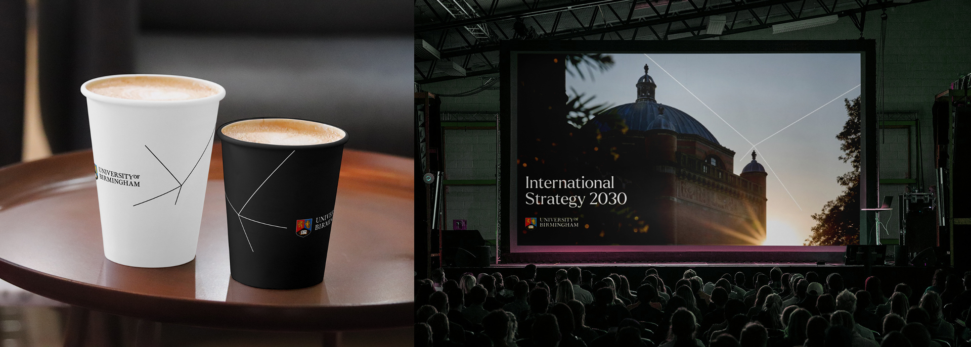
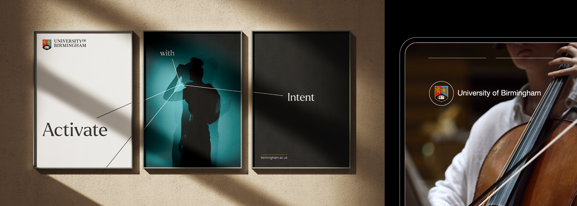
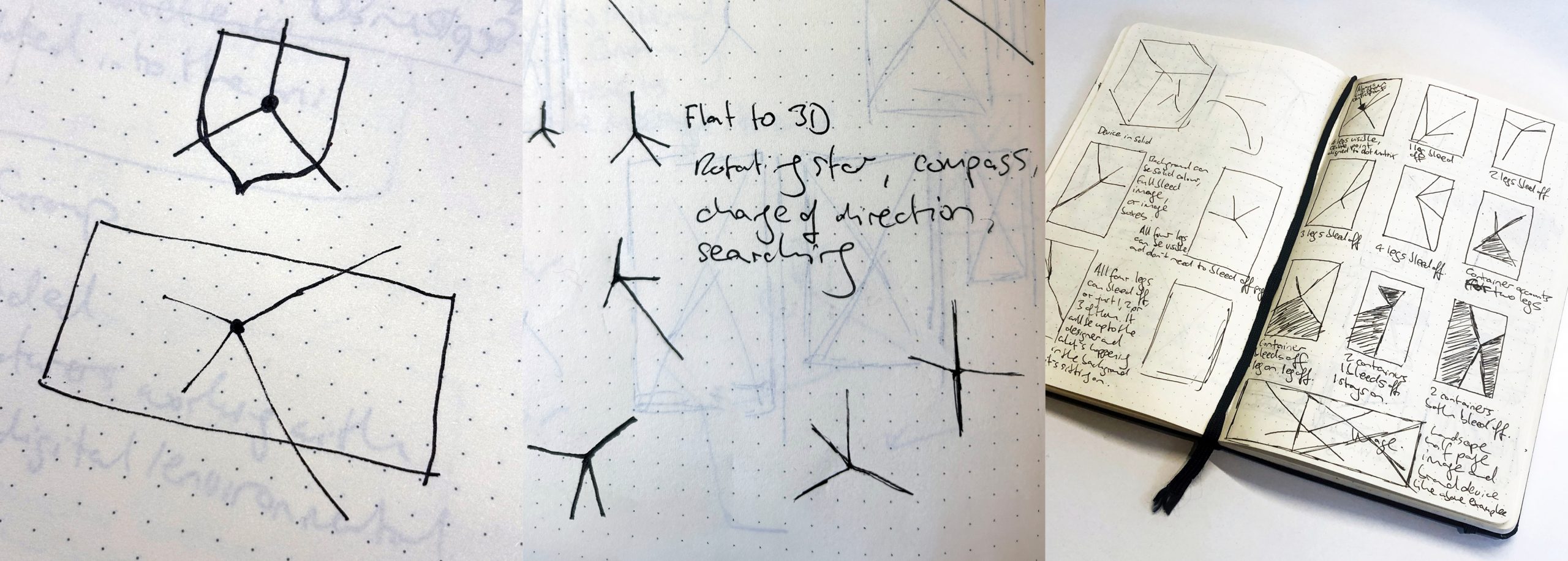
The Lines of Intent in their simplest form can spin, rotate, search and reach.
Our innovative dot matrix grid serves as a versatile foundation, designed to accommodate various formats seamlessly. This feature provides the Lines of Intent with a defined set of anchor points for precise alignment, promoting thoughtful layout choices and facilitating enhanced structural integrity for all communication outputs.

Loading
The versatile nature of the dot matrix grid facilitates the precise implementation of layout consideration and robust design structure across all formats.
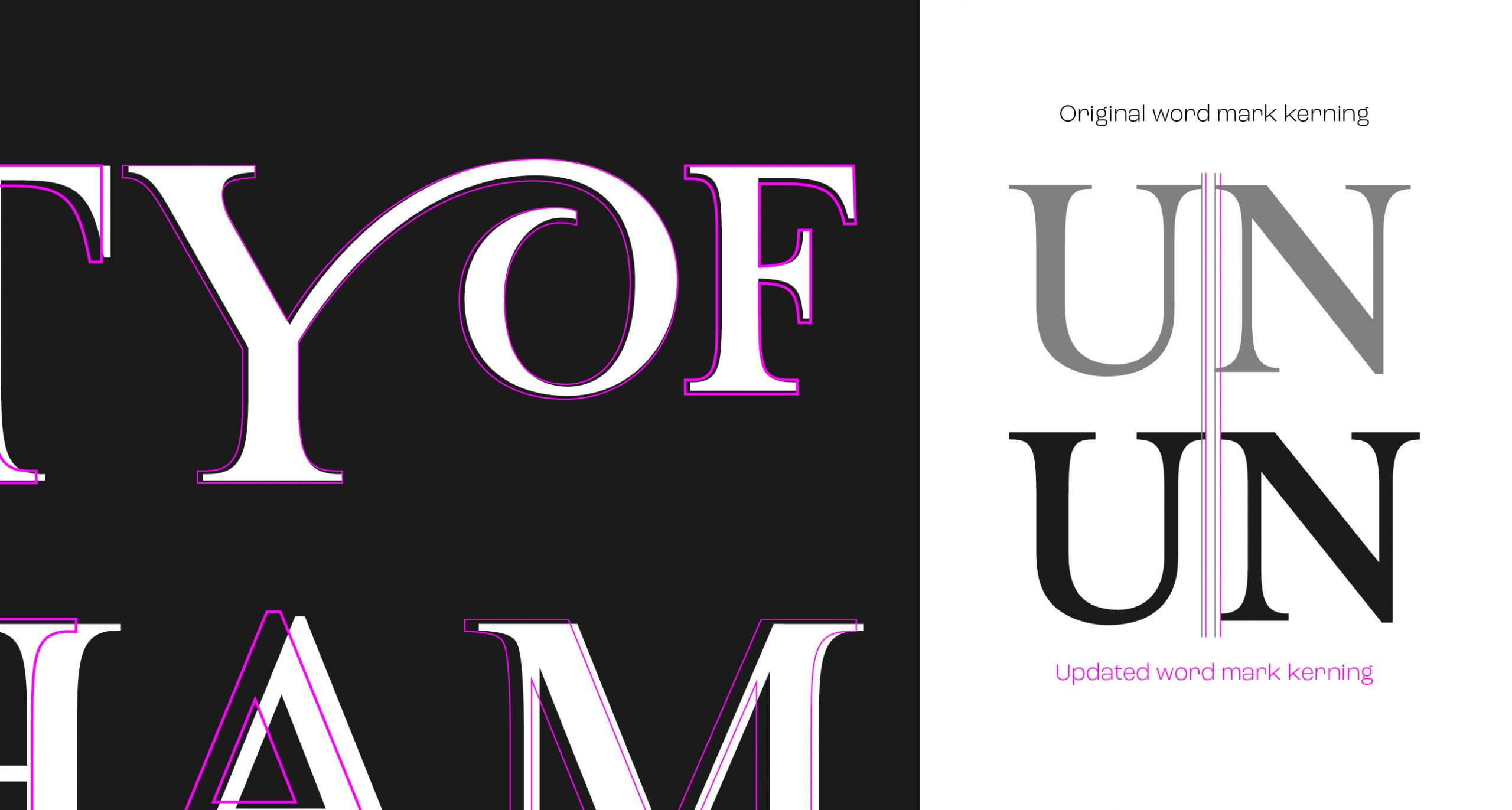
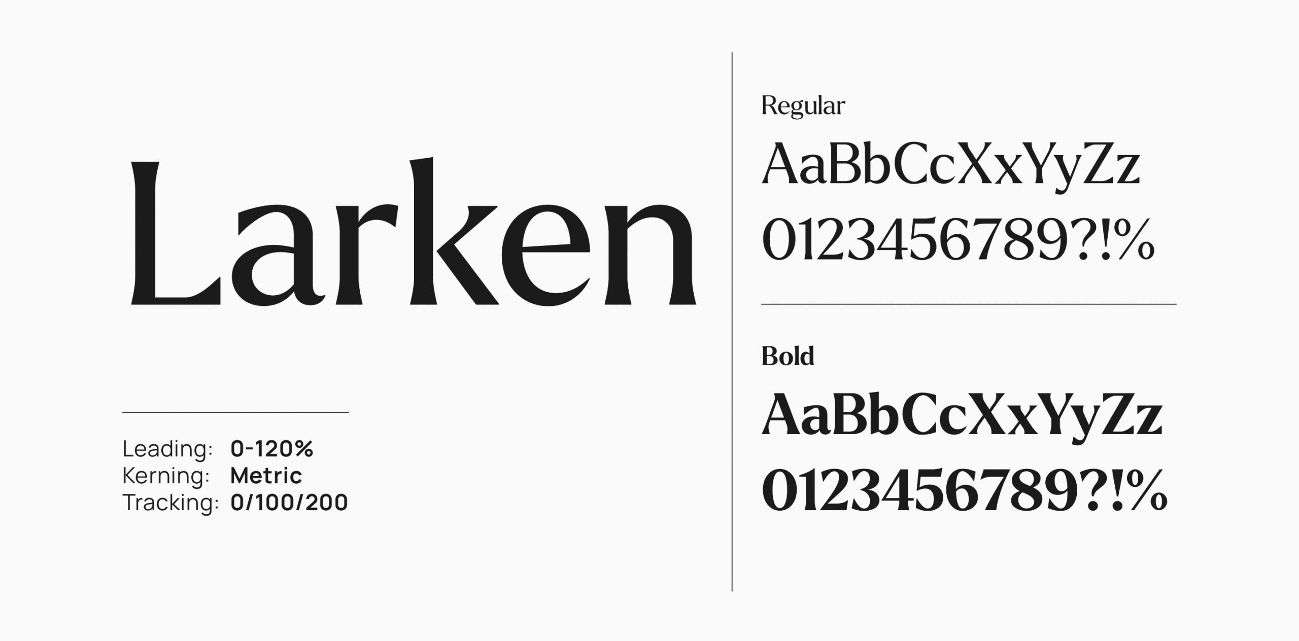
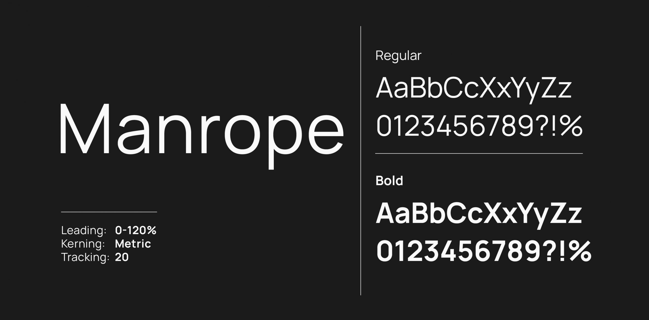
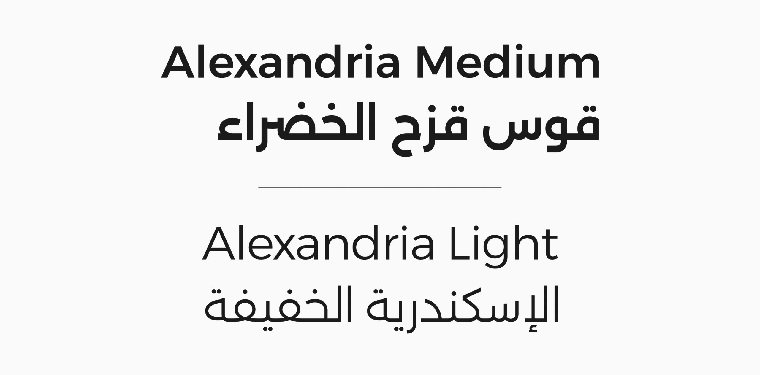
A typographic library with accessibility at it’s core
We engaged in an extensive phase of typographic exploration and accessibility testing to select the typefaces for our brand. Our priority was to discover a modern, distinctive font that also preserves a deep-rooted sense of heritage and tradition.
A colour palette inspired by a tradition
Our aim was to introduce an accessible colour palette that challenged the conventional norms of the higher education sector. We used the architectural heritage of Birmingham to define a range of colours that would be in keeping with the tones and hues of the university campuses.
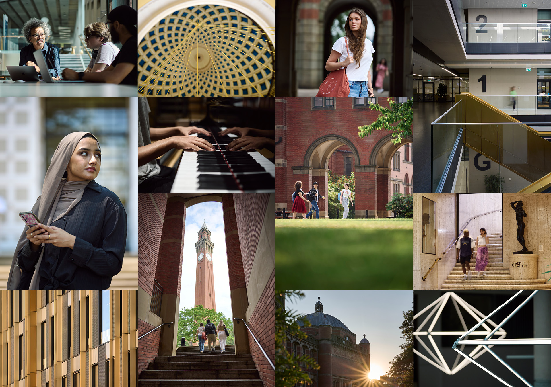
Capturing the past, present and the future
An editorial point-of-view was adopted in our approach to an updated image library, favouring a minimalist aesthetic to encapsulate authentic campus moments. Imperfections were embraced as a genuine portrayal of reality, forgoing post-editing, allowing the raw reality of each image to resonate independently.